
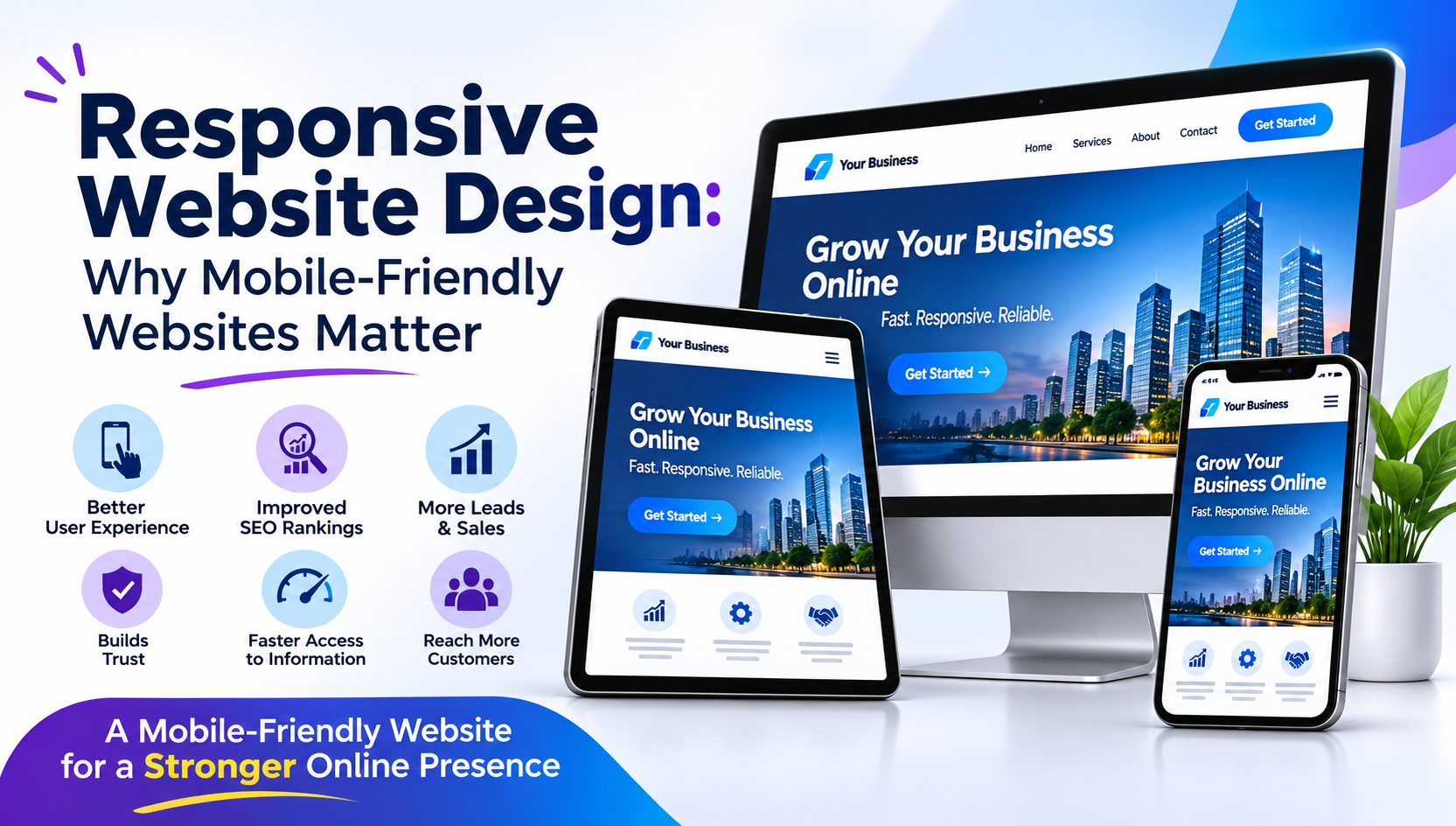
The way people browse the internet has changed significantly over the last few years. Today, most users do not wait until they reach a computer to visit a website. They search for products, compare services, read blogs, shop online, and contact businesses directly from their smartphones.
This change has made responsive website design an essential part of building a successful online presence. A website that looks attractive on a desktop but becomes difficult to use on a mobile phone can quickly lose visitors and potential customers.
Whether you run a small business, an online store, a startup, or an established company, having a mobile-friendly website helps you reach more people and provide a better browsing experience.
In this guide, we will explain what responsive website design means, why mobile-friendly websites matter, and how a responsive website can help your business grow.
What Is Responsive Website Design?
Responsive website design is an approach to website development that allows a website to automatically adjust its layout, images, text, and other elements according to the screen size of the device being used.
For example, when someone visits your website from a desktop computer, they may see a wide navigation menu, multiple content columns, and large images. When the same person opens your website on a smartphone, the layout adjusts to fit the smaller screen.
The main purpose is to make sure visitors can access information easily without constantly zooming in, scrolling horizontally, or struggling with small buttons.
A properly responsive website works smoothly across:
- Desktop computers
- Laptops
- Smartphones
- Tablets
- Different screen resolutions
Responsive design is not simply about making a website smaller. It is about creating a consistent and comfortable experience for every visitor.
Why Are Mobile-Friendly Websites Important for Businesses?
A business website is often the first place where potential customers learn about your company. If visitors find your website difficult to use on their phones, they may leave and choose another business.
Here are some important reasons why mobile-friendly websites are valuable for businesses.
1. Most People Browse Websites on Smartphones
Smartphones have become one of the most common ways to access the internet. People use their phones while travelling, during breaks, at home, and even while comparing products in physical stores.
A mobile-friendly website makes it easier for these visitors to explore your services, read information, and contact your business.
For businesses targeting customers in India, mobile accessibility is particularly important because smartphones play a major role in everyday internet usage.
2. Better User Experience
User experience has a direct impact on how visitors interact with your website.
Imagine a customer visiting your website to find your phone number, but the text is too small and the contact button is difficult to click. This creates unnecessary frustration.
Responsive website design solves many of these problems by providing:
- Easy-to-read text
- Properly sized buttons
- Simple navigation
- Flexible images
- Well-organised content
- Comfortable scrolling
When visitors can find what they need without difficulty, they are more likely to spend time exploring your website.
3. Helps Improve Google Search Visibility
Google uses the mobile version of a website for indexing and ranking through mobile-first indexing.
This means having a well-designed mobile website is important for your overall SEO strategy. If your mobile website has missing content, poor navigation, or technical problems, it can affect how effectively Google understands and evaluates your pages.
A responsive website can support better SEO by providing:
- Consistent content across devices
- A single website URL for each page
- Easier website management
- Better mobile usability
- A more consistent internal linking structure
However, responsive design alone does not guarantee higher Google rankings. Website speed, useful content, technical SEO, and overall page experience also matter.
4. Faster Access to Information
Mobile visitors usually want information quickly. They may be searching for a service, checking product prices, looking for business details, or trying to make a purchase.
A responsive layout helps present important information in a clear and organised way.
For example, a business website can place its main services, contact information, enquiry form, and WhatsApp button where mobile users can easily find them.
When information is accessible, visitors can make decisions more confidently.
5. More Leads and Business Enquiries
Your website should do more than simply display information. It should help convert visitors into customers.
A mobile-friendly website makes it easier for potential customers to:
- Call your business directly
- Send a WhatsApp enquiry
- Fill out contact forms
- Request a quotation
- Book appointments
- Purchase products online
Even small improvements, such as a visible call button or a shorter enquiry form, can make a difference to the number of enquiries your business receives.
6. Builds Trust and Professional Credibility
People often judge a business by the quality of its website.
A website that looks outdated, has broken layouts, or displays poorly on smartphones may create doubts about the business.
On the other hand, a clean and responsive website gives visitors a more professional impression.
It shows that your business cares about customer convenience and keeps its online presence updated.
Important Features of a Responsive Website
A good responsive website combines attractive design with practical functionality. The following features help create a smooth experience across different devices.
Flexible Website Layout
The website layout should automatically adjust according to screen width. Content should fit naturally without creating horizontal scrolling.
Mobile-Friendly Navigation
Desktop menus do not always work well on smaller screens. A mobile navigation menu, often using a hamburger icon, helps visitors find important pages easily.
Readable Typography
Text should remain comfortable to read on smartphones and tablets. Font sizes, line spacing, and paragraph width should be adjusted for different screens.
Optimised Images and Videos
Large images can slow down websites, especially on mobile internet connections. Proper image compression, responsive image sizes, and modern formats such as WebP can help improve loading performance.
Touch-Friendly Buttons
Buttons and links should have enough space around them so visitors can tap them accurately.
Examples include:
- Call Now
- Contact Us
- Get a Quote
- WhatsApp Us
- Buy Now
Mobile-Friendly Forms
Forms should be simple, properly spaced, and easy to complete using a smartphone keyboard. Avoid asking visitors for unnecessary information.
Responsive Website Design vs Mobile Website Design
Many business owners confuse responsive website design with a separate mobile website. Although both aim to improve mobile browsing, they work differently.
Responsive Website DesignSeparate Mobile WebsiteOne website adapts to different screensA separate mobile version is createdUsually uses the same URLMay use a separate URLEasier to maintainRequires additional managementConsistent content across devicesContent may differSuitable for modern websitesCan require additional technical work
For most new business websites, responsive website design is the more practical approach because it provides a consistent experience without maintaining separate desktop and mobile websites.
How Responsive Website Design Supports SEO
Search engine optimisation is an important part of growing an online business. A website needs to be accessible, understandable, and useful to both visitors and search engines.
Responsive design supports SEO in several ways.
Mobile-first indexing: Google primarily uses the mobile version of website content for indexing.
Better page experience: A properly designed mobile website can make navigation and interaction easier.
Consistent URLs: Having one URL for each page makes sharing, tracking, and maintaining website content simpler.
Improved usability: Visitors can access content without dealing with layout problems or unnecessary zooming.
Better engagement opportunities: When users can navigate easily, they have more opportunities to explore your services and products.
For the best results, combine responsive design with technical SEO, fast hosting, optimised images, structured data, quality content, and proper internal linking.
Common Responsive Website Design Mistakes to Avoid
Even a website that appears responsive can have problems that affect visitors.
Here are some common mistakes businesses should avoid.
- Using very small text: Visitors should not need to zoom in to read important information.
- Oversized images: Unoptimised images can increase loading times.
- Difficult navigation: Important pages should be easy to find on smaller screens.
- Small clickable buttons: Buttons should be comfortable to tap.
- Too many pop-ups: Intrusive pop-ups can interrupt mobile browsing.
- Poorly designed forms: Complicated forms can discourage enquiries.
- Ignoring mobile testing: A website should be checked on different devices and screen sizes before launch.
Avoiding these issues helps create a website that is both attractive and practical.
How to Check Whether Your Website Is Mobile-Friendly
You do not need advanced technical knowledge to identify basic mobile usability problems.
Follow these simple steps:
- Open your website on an Android smartphone and an iPhone, if available.
- Check whether the website fits the screen without horizontal scrolling.
- Open the navigation menu and visit important pages.
- Test buttons, contact forms, and WhatsApp links.
- Check whether images load correctly.
- Test website performance using Google PageSpeed Insights.
- Review mobile usability and indexing information in Google Search Console.
Pay attention to both appearance and functionality. A website may look good on a mobile screen but still have slow-loading pages or buttons that do not work correctly.
Why Choose BEGRIDS for Responsive Website Design?
Choosing the right website development company is an important decision for any business. Your website should represent your brand professionally while making it easy for customers to connect with you.
BEGRIDS provides website designing and development solutions focused on business requirements, usability, and modern web technologies.
Whether you need a new business website, an eCommerce platform, a custom web application, or an existing website redesign, the focus should be on creating a solution that works smoothly across devices.
BEGRIDS can help businesses with:
- Responsive website designing
- Custom website development
- Business and corporate websites
- eCommerce website development
- WordPress website development
- Custom web applications
- Website redesign and improvements
- SEO-friendly website structure
A professional website is not just an online identity. It is an important business tool that can help you build credibility, attract visitors, and generate enquiries.
Final Thoughts
Responsive website design has become a basic requirement for businesses that want to succeed online. Customers expect websites to work smoothly whether they are using a smartphone, tablet, laptop, or desktop computer.
A mobile-friendly website improves accessibility, makes navigation easier, supports SEO, and creates more opportunities to connect with potential customers.
If your existing website is difficult to use on mobile devices, this is a good time to consider improving its design and functionality.
Give your customers a better browsing experience with a responsive website designed around their needs.
Contact BEGRIDS to discuss your website designing and development requirements.
Frequently Asked Questions (FAQs)
1. What is responsive website design?
Responsive website design is a website development technique that automatically adjusts the layout, images, text, and other elements to fit different screen sizes and devices.
2. Why is a mobile-friendly website important?
A mobile-friendly website makes it easier for visitors to browse, read information, contact businesses, and purchase products using smartphones and tablets.
3. Does responsive website design help SEO?
Yes. Responsive design supports Google's mobile-first indexing by making it easier to provide consistent content and functionality across devices. However, it does not guarantee higher rankings on its own.
4. Is responsive website design necessary for small businesses?
Yes. Small businesses can benefit from responsive websites because potential customers often search for local services and products using smartphones.
5. What is the difference between responsive and mobile-friendly websites?
A responsive website automatically adjusts to different screen sizes. A mobile-friendly website is a broader term describing a website that is easy to use on mobile devices. A responsive website is generally mobile-friendly when implemented correctly.
6. How much does responsive website design cost in India?
The cost depends on website complexity, number of pages, features, design requirements, and integrations. A basic business website generally costs less than a custom eCommerce website or web application.
7. How can I make my existing website responsive?
You can make an existing website responsive by updating its layout, CSS media queries, navigation, images, typography, and interactive elements. A professional website developer can review the existing structure and recommend the necessary improvements.